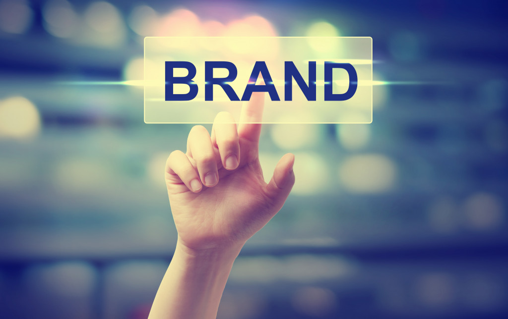
A logo is a powerful way of branding. The Harvard Business Review even made a study on 597 different logos and their impact on companies. According to the website, a powerful logo helps a business sell its products and improve brand performance.
This is why logos are found in every merchandise, printed in tarpaulins for events, and other promotional materials. They can also be found on websites, business cards, and other social media sites. A logo is a tangible expression of a brand and communicates its qualities and values; it is something companies use to imprint their brand on a client’s mind.
What are the different types of logos?
In general, logos are marks that represent a brand. It can be a wordmark or a letter mark. Brands like Coca-cola, Visa, and Sony uses wordmarks; it means that they are using words for their logo.
A letter mark, on the other hand, contains letters or initials of a brand. Adobe’s letter mark, A, is a perfect example. CNN, IBM, and HP use letter marks as well.
Symbols can also be used in a company or brand logo. This is called a logomark. Brands such as Mac and Nike use symbols for their logos: a swoosh for Nike and an apple for Mac.
Other companies or brand logos use emblems or combination marks. An emblem is either a logomark, wordmark, or letter mark that is inside a particular shape. Perfect examples are Harley-Davidson Motor Cycles and Starbucks. Nike uses a combination mark logo, too, that includes the brand’s name and the swoosh symbol.
What makes a good logo?
According to Harvard Business Review, study reveals that descriptive logos are the best type of logo that a company can use. A descriptive logo effectively uses text and symbols to clearly convey the product or service offered by a brand.
For example, Burger King uses a descriptive logo because the design incorporates visual burgers and the text burger. By doing so, the company communicates to its customers that it is selling burgers as its main product.
However, studies also reveal that 60% of companies use nondescriptive logos. Nondescriptive logos are those that do not indicate the service or product offered by the company. McDonald’s, for instance, uses a nondescriptive logo.
Despite the popularity of nondescriptive logos, Harvard Business Review’s study reveals that descriptive logos are more beneficial. Using descriptive logos positively impacts customers’ brand perception, and this results in increased brand performance.

Importance of a Logo
Whether it be a descriptive or nondescriptive logo, a good logo must reflect the brand’s identity.
A properly designed logo builds consumer trust. Sometimes, people develop brand loyalty through logos. For instance, GAP has an iconic logo with loyal fans. These loyal fans were even furious when GAP attempted to change the logo without consulting them.
Additionally, a well-designed logo is an indication of a brand’s professionalism. When a logo is not designed professionally, it can directly affect a customer’s perception of a brand. Consumers may think that a company with a poorly designed logo cannot also deliver excellent products and services.
Lastly, a stand-out logo sticks to a consumer’s memory and creates a positive symbol that customers can associate with your brand. Additionally, a great logo connects to people’s emotions.
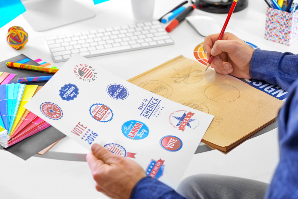
Creating a good logo
A business, whether big or small, need a good logo. The best logo is one that is simple and can be easily interpreted by the consumers. Different elements should be considered in the design of a logo; these include colors and typography.
Colors
A logo’s color is powerful in the sense that it helps in improving brand recognition. People can easily recognize a brand through its colors because subconsciously, colors affect our emotions.
Business Insider shares some emotions associated with different colors. It states that red usually evokes feelings of intensity, passion, aggression, and action. This is the reason why the brand, Red Bull, uses red in its logo.
On the other hand, blue is associated with feelings of trust, clarity, calmness, and comfort. Perhaps, these are the emotions that the brand, Ford, wants to trigger among its consumers. Meanwhile, the color yellow is used by McDonald’s; it evokes feelings of joy, energy, and sunshine.
Typography
Like color, the typeface used in a logo can also evoke emotions. The typeface Comic Sans, for instance, is usually associated with the feeling of playfulness and whimsy. Times New Roman, on the other hand, is seen as more serious and professional.
Whatever typography one chooses, the most important thing is to reflect the company’s values. It should both be pleasing to the eyes and functional at the same time.
Overall, the goal of a brand logo is to stir emotions and to effectively communicate a brand’s identity to its consumers. Hence, whatever elements a company chooses to include in the logo, it should always be honest and true to the brand.